Can I master the product easily or does it dominate me?

I’ve never heard a productivity influencer say “hey just go offline sometimes”, but the offline web is here, it’s speedy, it’s the original focus mode.
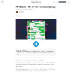
There’s a profoundly different atmosphere, in my opinion, when chatting over Slack vs. Telegram. As Slack was built to serve teams for internal communication, it feels commercialized by its nature. Slack’s channels feature is well suited for organic teams, but when it comes to causal interactions it feels less friendly. In contrast, Telegram was initially built as an alternative for casual, instant messaging. When you take the single chat interface into communities, it often feels like a trollbox, but ironically it creates an intimate experience in some way.

On a personal level, I’ve noticed when using Telegram for work purposes, it often takes the role of other apps. The ability to send large files (up to 2 GB) is ridiculously easy, which reduces the need for email, or file transfer services style WeTransfer. As for productivity, I could use it over Slack for chatting with peers, and organizing chats into folders helps to reduce the massive noise tons of groups tend to create, which makes the overall experience calmer. This blend of features, ranging from work to personal uses, creates Telegram an identity of a super app, and not in the X way. This unique market position often makes me sound some bizarre claims like Telegram could become the next social network or email client.

Mercury is…
(1.) Fluid
Instead of asking people to modify their thoughts and actions around the arbitrary sandboxes of Apps, Mercury responds fluidly to the intentions of its user, alleviating the risk of interstitial friction that all multi-tool workflows carry.
(2.) Focused
The clutter we take for granted in today’s operating systems can be overwhelming, especially for folks sensitive to stimulation. Mercury is respectful of limited bandwidths and attention spans, and rejects the idea of “notification driven engagement.” Information will not be pushed to the user unless they intentionally ask for it. Mercury’s intention-as-context architecture vaccinates the user against the unintentional consumption of information.
(3.) Familiar
Mercury introduces new ideas and metaphors through familiar interaction patterns on an existing device: Mercury is designed for multi-touch tablets with keyboard support — a category often overlooked as awkward hybrids straddling two worlds. Mercury...
- Embrace smallness
- Build for fidget-ability
- Embrace plain text
- A single interface for mobile and desktop
- Refine by pruning
before you get too deep into the process of building, you should write out a short list of product design principles. The more unique and definitive your values are, the more useful they’ll be as a decision making tool later on.