The Poetry of Tools
“Digital poems are not necessarily ‘poems’ written by ‘poets;’ they are found in ads, conceptual art, interactive displays, performative projects, games, or apps. Poetic tools include algorithms, browsers, social media, and data… Digital poetry will be perceived as living, because it is living.” — David Jhave Johnston
I’m glad you’re on the other side of this glass screen. Using this laptop, the mouse is my avatar, clicking and scrolling for utilitarian means. Most use their devices in an automated way, without reflecting on their gestures. Let’s defamiliarize our tools and use them as a vehicle for contemplation.
While living in San Francisco, I noticed a constant evangelism surrounding the newest technologies. Exhibitions tether visitors to goggles and isolate them in virtual worlds. Digital displays react to the movements of those in front of them—an animism that is met with excitement but no further questioning of its appeal beyond pure novelty. I’ve often felt this failed to make us question how we might interact with digital technology in a conscious, meaningful way. Afterall, technology is only a tool. Better yet, technology is a form of language. Perhaps we are so fascinated by the progress of digital technology because it brings us closer to understanding ourselves.
Tools shape the way we behave. We point, swipe, skim, type, click, send. How can we reconsider the actions we perform in our daily interfaces? Identifying the constraints of these tools can help us recognize their poetic potential. The limited capabilities of technology shaped the appearance of early computer art. Newer works identify these limitations and exploit them as critical, often humorous acts. Some also compile, reconfigure, and build from found content.
This survey of work attempts to organize examples from early computer art, digital translations, and media art within a flexible taxonomy of the poetry of tools.
Slow Growth & Slow Death
Is the web living? The question can be answered by the antecedent: it is living because it can die.
Eduardo Kac, Genesis, 1998
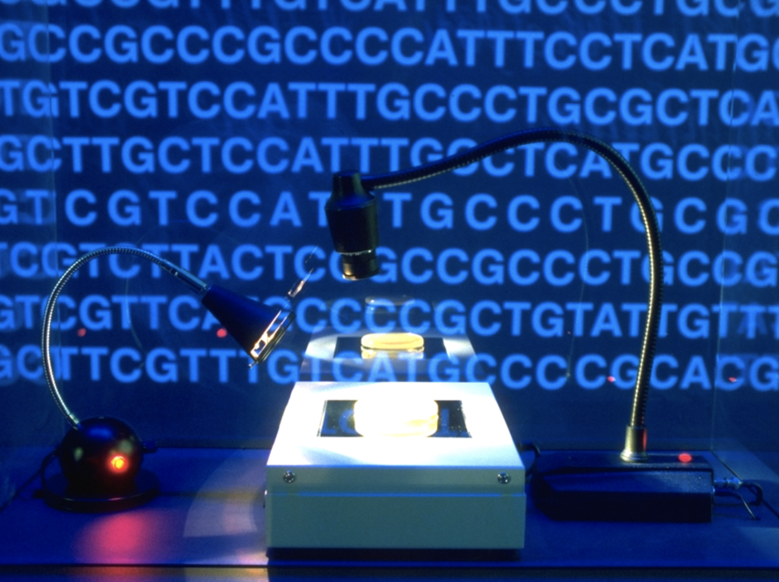
For the exhibition Genesis in 1998, Eduardo Kac inserted a biblical verse into a strand of DNA by first translating the sentence into Morse Code and then converting the Morse Code into DNA base pairs. By accessing a website, networked viewers were able to turn on an ultraviolet light in the gallery that would cause biological mutations in the bacteria. Adding more or less light would speed up or slow down what Kac called “cellular publishing.”
Penelope Umbrico, All the Catalogs (A-Z), 2002
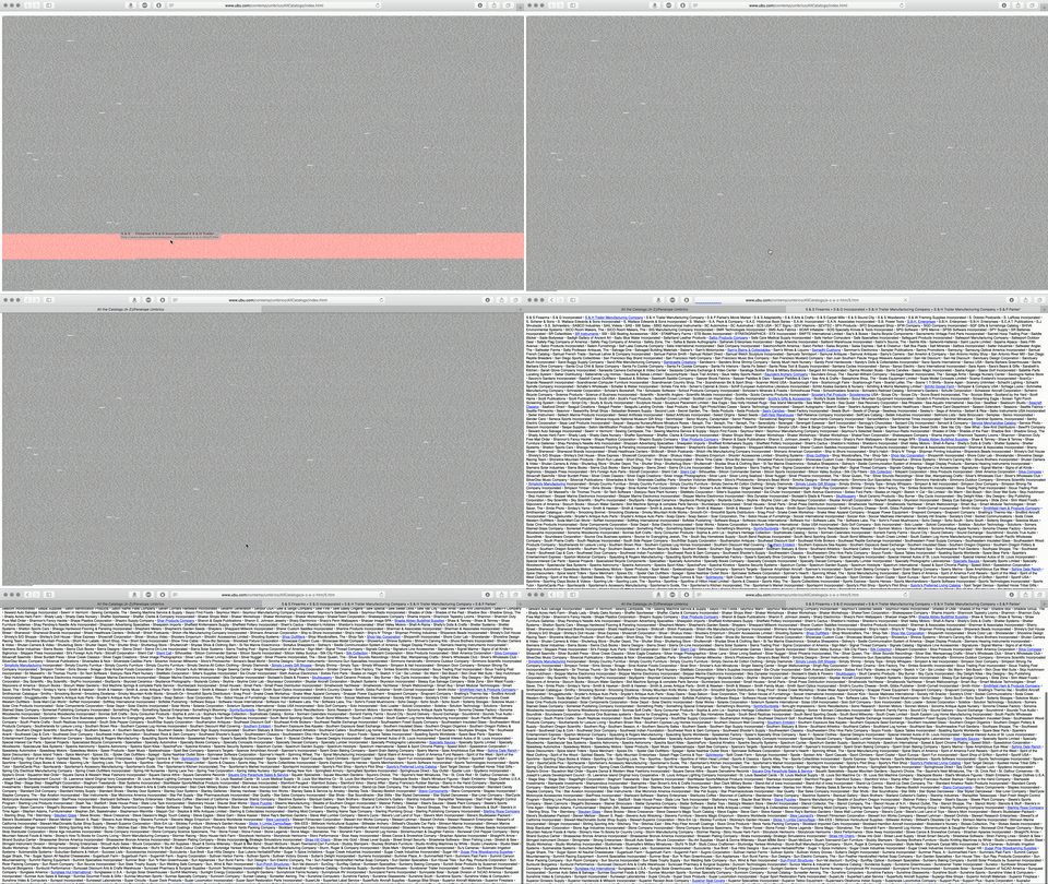
The initial page load of Penelope Umbrico’s 2002 All the Catalogs (A-Z) is intentionally illegible. It is comprised of tightly packed rows consisting of the names of the 15,194 available mail-order catalogs on the Internet in 2002, listed in alphabetical order. Clicking on the page will highlight in red all of the catalogs that begin with a given letter. Clicking again opens a new page of that section at a larger size. On this detail page, only a handful of titles have active blue links; when a link rots and dies, it turns black. As Umbrico writes on her site, “All Catalogs (A-Z) 2002 is a time sensitive piece: At some point when all the links are dead, the piece will be dead as well.”
Early Works
In early examples of Human–computer interaction, technological limitations shaped the work, and poetic forms emerged from those constraints. Beyond aesthetics, their constraints also influence how these works were and are consumed. The pace of these pieces, intentional or not, causes the visitor to sit, watch, and listen.
Myron Krueger, Videoplace, 1985
Computer artist Myron Krueger is considered to be a pioneer of virtual reality research. He focused on exploring the interactions between humans and computers. By 1985, Krueger had created Videoplace to explore early computer vision and interaction work within the University of Connecticut's Artificial Reality Lab. Users in the space were able to see their actions as crude silhouettes interacting with on-screen buttons and objects.
Jeffrey Shaw, Legible City, 1989

Jeffrey Shaw’s 1989 Legible City is a pioneering interactive art installation. Using real city plans of Manhattan, Amsterdam, and Karlsruhe to construct his virtual cities, Shaw lined the streets with computer-generated, three-dimensional letters that form words and sentences. The visitors would sit on a stationary bicycle in front of the projection of this simulated city. Their movements and speed propelled them through the city streets and allowed them to read the messages that lined them. In this Manhattan version of the installation, the paths followed eight color-coded monologues by figures who shaped the architecture of New York City—notably Frank Lloyd Wright and Donald Trump.
David Rokeby, The Giver of Names, 1990
In 1990, David Rokeby created the The Giver of Names. The installation consists of a pedestal surrounded by a pile of objects: rubber duck, yellow pin, toy car, watering can, rain boot. Visitors place random objects on the pedestal, prompting a computer to process them by shape, color, and their relationship to each other. The computer then constructs a sentence that is nonsensical but discernible. From a ‘still life’ of a lime green toy gun, yellow rubber duck, and yellow pin, for example, the robotic voice reads: “In that issues morrow across from this benefiting bath with which the Irishman had substituted a first robber, this dolly underneath each lime tree sagged.”
Performing Data
“Data is good for more than computation and extrapolation. It is also meant to be built upon and reassembled. There is prose and poetry and performance to be made from these rows and columns.” — Jer Thorp
While those earlier pieces examined the visible interface that allows humans and computers to interact, these later works explore how to visualize data and make it understandable. While data typically has a pragmatic function, it can be sequenced to criticize the content or showcase the form. Digital poetry can be found in this information by reordering and performing this found material.
Office of Creative Research, A Sort of Joy (Thousands of Exhausted Things), 2015
In April 2015, actors from the theater group Elevator Repair Service began performing a piece called A Sort of Joy (Thousands of Exhausted Things) within the halls of MoMA. After the museum released their collections database as a GitHub repository that same year, the Office of Creative Research transformed the data from over 120,000 artworks in the museum’s collection into a script for the actors to perform. Circling the gallery in plain clothes, intermingled with museum-goers, the actors read an endless stream of titles, dates, and critiques. Removed from the context of the artwork, the performance focused on the data itself and reshaped how it can be consumed.
Jörg Piringer, Unicode, 2011
In 2011, Jörg Piringer created Unicode, a video that shows all 49,571 of displayable characters in the Unicode range at the time, depicting one character per frame. It is an example of what he calls ‘datapoetry,’ an umbrella term that includes coded poetry described as “encoded, decoded, programmed poetry or codes interpreted as abstract poetry.”
Removing Function from Form
Rather than reinterpreting data, some artists work directly with the form of interfaces. To separate the aesthetic of the tool from its proposed purpose, the pieces below reimagine the outward facing elements of our tools and browsers.
Emilio Gomariz, AI Pro, 2012
<video controls="controls" width="100%" height="400" src="https://s3.amazonaws.com/arena-attachments/1135990/5ca882e34dd9cea1da8e9fed0874e643.mov?1500411456"></video>
In Emilio Gomariz’s 2012 Macintosh Lab series, he animates compositions using the features, tools, and operating systems we use daily. In this piece, AI Pro, he exposes and arranges every tool within the program and animates them with pre-existing shortcuts and gestures. In a piece for Rhizome, artist and writer Jason Huff writes, “Gomariz reframes our functional desktops as the expansive canvas…his choreographed hand reveals the performative nature of computerized commands and the formal beauty within our taken-for-granted digital tools.”
Philippe Cao, Ritual for Empowerment, 2014
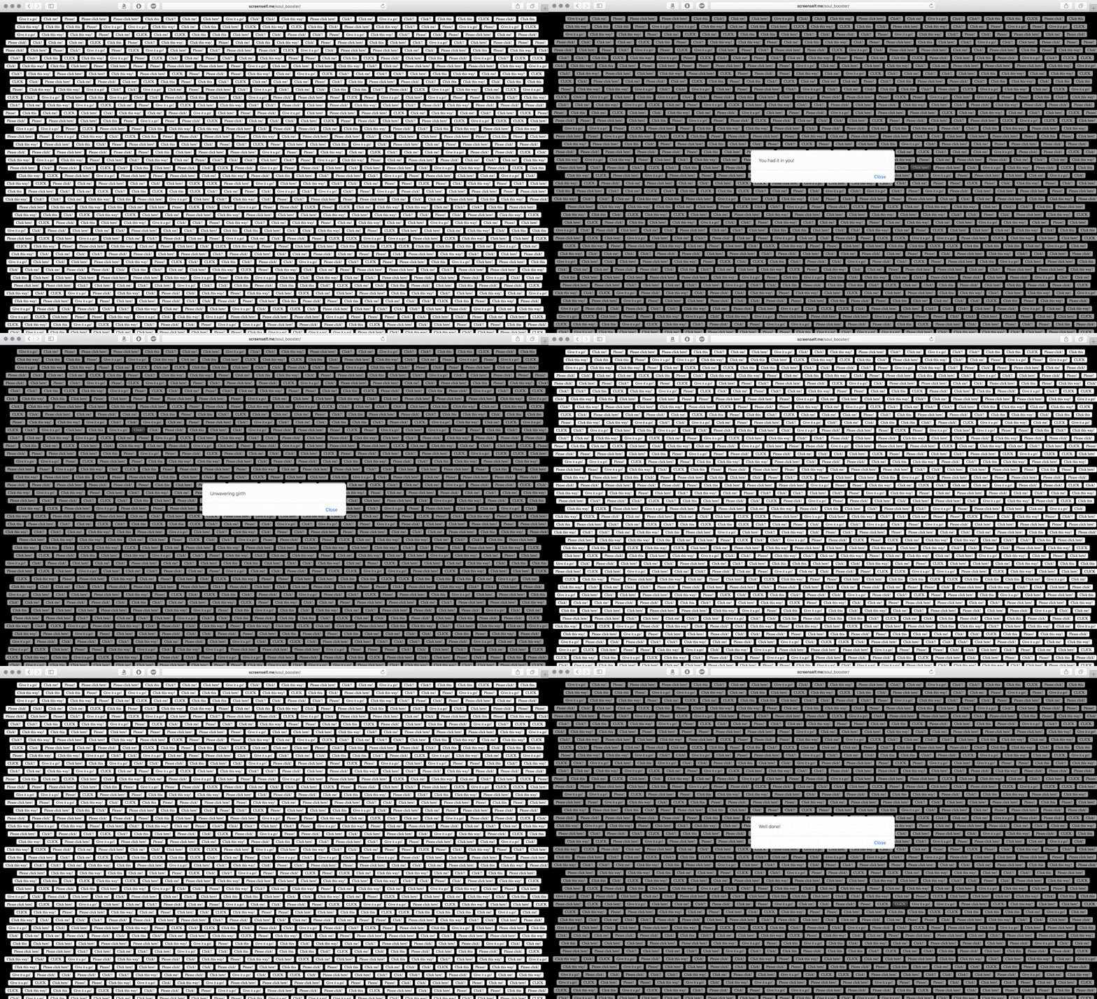
In Philippe Cao’s RISD thesis, he calls on users to create a ‘screen-self’ to meditate upon the rituals of micro-interactions like clicking, scrolling, swiping. He develops several microsites to focus on each of these actions. Ritual for Empowerment, above, displays a mass of buttons using the default styling for the HTML tag button. They compel the visitor to click with their calls to action, “Please! Give it a go! Please click here! Click me?” Pressing each button opens a pop-up window with a compliment or uplifting statement, “Genius! You’re having a field day! You’re special!”
Alexei Shulgin, Form Art, 1997
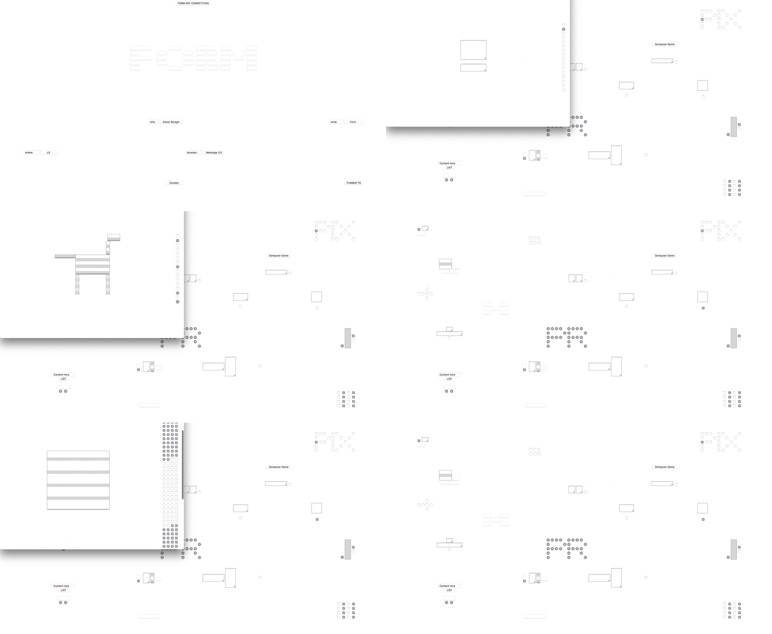
In 1997, artist Alexei Shulgin created a web piece called Form Art. Form Art transforms the most bureaucratic and functional aspects of the web—HTML conventions that take the form of menus, checkboxes, and surveys—into aesthetic elements. On Shulgin’s site, the function of these default HTML forms are now useless, allowing their appearance to be repurposed and highlighted in a maze of forms and hyperlinks. In Shulgin’s own words: “Bringing [the forms] in focus was a declaration of the fact that a computer interface is not a 'transparent' invisible layer to be taken for granted, but something that defines the way we are forced to work and even think.” Because the forms are positioned but unstyled, as web browsers update, the visual appearance of these fields become more modern as well.
Sebastian Ly Serena, 2015

Similarly, designer Sebastian Ly Serena's portfolio site is an animation of forms that take the viewer through a Rube Goldberg-esque sequence that eventually leads to his email address. Serena’s site is not interactive; rather, it begins playing upon page load, asking the visitor to pause and observe.
Production of Errors
Like with earlier works, poetic explorations of new technology can result from pushing against a set of technological constraints and reimagining existing works or interfaces. Digital correspondence is part of daily life, and the mistakes that emerge from them — typos, autocorrect, typeaheads — are acknowledged and accepted into modern-day communication. These works embrace these missteps, exploit them as commentary or art or humor, and create platforms for the production of new errors.
Yasmeen Khaja, Jared Kitade, and Jimmy Don, Align Text, 2017
During a Bots & Automation workshop co-led with Chris Hamamoto, an instructor at California College of the Arts, team members Yasmeen Khaja, Jared Kitade, and Jimmy Don tested the limits of the Google Translate Images app. The app uses Augmented Reality to translate text from one language into another in real time. In the test shown, the team sets the translation from English to Spanish, then trains the phone camera lens on a keyboard. As the app tries to find English words in the keyboard that it might be able to translate, it builds false connections and creates words that do not exist.

Khaja, Kitade, and Don began looking for other instances of Google Translate Images that misinterpreted lines and textures as words. They now screenshot these glitches, and share them on their Instagram @aligntext. In another example, the team asks the app to translate a piece of raw meat. By setting the translation from Japanese to English, Google Translate tries to read the white lines in the meat as Japanese characters that it can translate.
Damon Zucconi, Debt, 2017

Damon Zucconi’s Debt performs the errors you might get when typing by hand. By factoring in the probability of fat fingering the surrounding keys while texting, Debt pours the familiarity of conversational messaging into a rapid stream of courtesy that questions the disingenuity and automation of thanks.
Jürg Lehni, Apple Talk, 2007
In Jürg Lehni’s second iteration of Apple Talk (2007), a microphone sits in front of each Macintosh computer. Using text-to-speech and voice recognition software, the machines endlessly transcribe written sentences into spoken word and then back again. Here you can see their production of poetic errors. The cascade begins with “It can only be attributable to human error” and builds in absurdity in this game of telephone.
It can only be attributable to human error It can only been attributable to human never It can only be a change about to human ever It can only be inching gamble to human error It can only the engine damn ball to human ever It can only be in June and done a human and neck It can only be a change about to human on Nick
Regeneration
Technology can give new life to old works by preserving it and making it accessible. The original works shown here were experimental at the time through the anticipation or use of new technology (that is now old). Updating them with our current technology can honor their original intention: to push against the boundaries of form and media.
“We’re often too quick to imagine that we’ve actually learned from the past. But new works often tend to recycle the same ideas over and over again into different media. To me this suggests that we might be more open to letting old works speak, that our task might not be so much to make new works but to build new platforms for old works to speak from.” — Rick Prelinger
First Screening

In 1983, bpNichol programmed First Screening in the Apple BASIC programming language. This was a suite of a dozen programmed, kinetic poems. Soon after, Apple IIe became obsolete and, like many early digital works, bpNichol’s poems were inaccessible. In 1992, a Hypercard version was published on a floppy disk—but again, this died within a few years. In 2006, Marko Niemi and Jim Andrews created a JavaScript version of First Screening on the online archive Vispo. In the project description, Jim Andrews writes, “The past of the art is in your hands and it is you who must recover and maintain it.”
A House of Dust
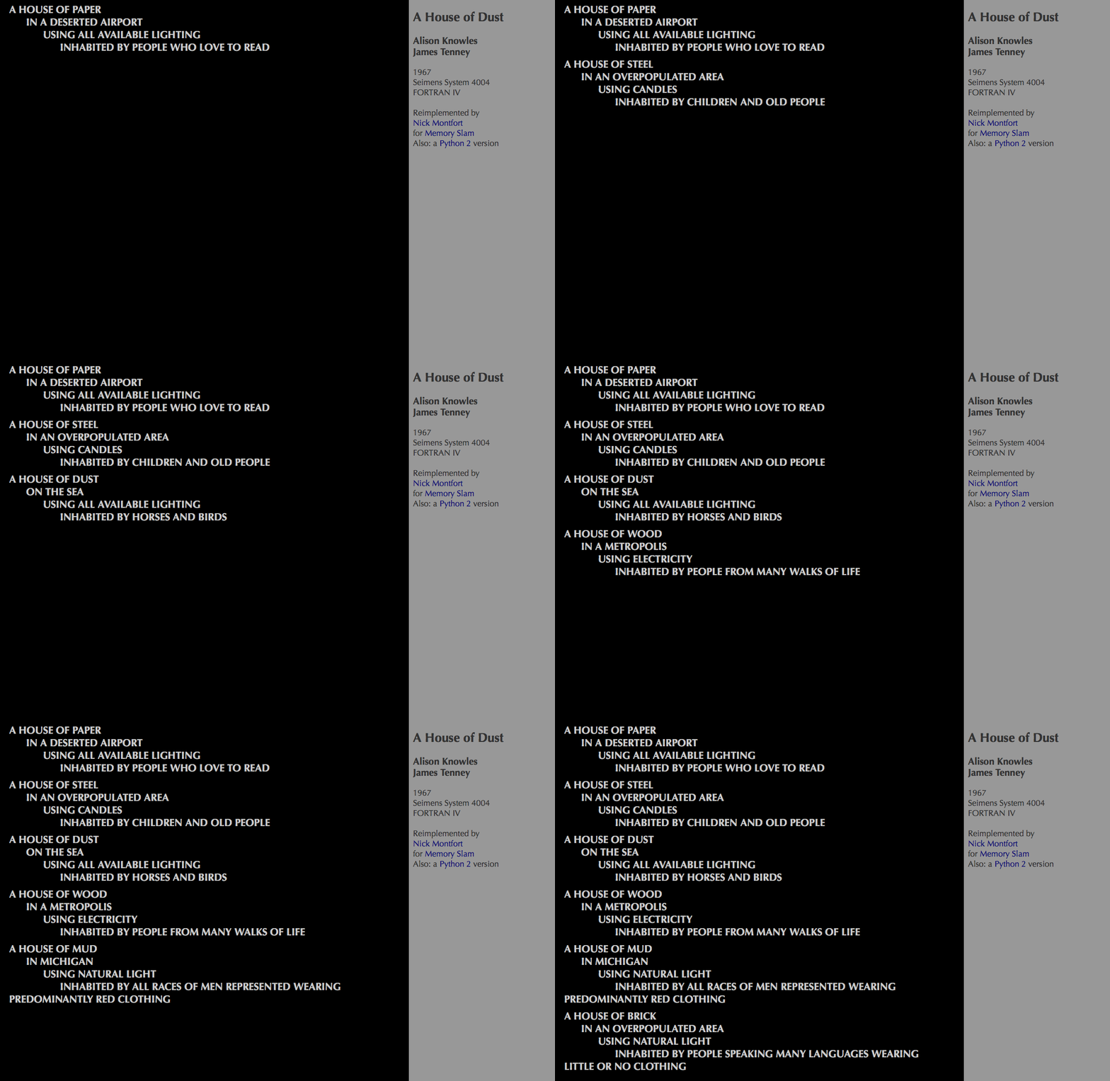
One of the first computer generated poems was A House of Dust, created by Alison Knowles and James Tenney in 1967. It demonstrated how the Fortran programming language could be employed in chance operations in art-making. The result is an edition of 500 different poems, each printed on 15 connected sheets of paper using a Dot Matrix printer. While there have been several adaptations of the piece, including this twitter bot, a notable example is Nick Montfort’s 2014 website of the same name. The poem uses fixed phrases followed by variable phrases that draw from a finite word bank:
A house of (material) (a site or situation) Using (light source) Inhabited by (inhabitants)
Sweethearts

In 1968, Emmett Williams created the concrete poetry flipbook Sweethearts, a narrative love story and kinetic animation. An anagrammatic erotic encounter between a "he" and a "she," the entire poem is derived from an 11x11 grid comprised of the word "sweethearts” seen on page 139. After discovering very little documentation of the poem, I felt compelled to make it accessible online. The format of the book informs the structure of the site. A strip of hatch marks acts as a video scrub bar that mirrors flipping through the pages, typed by hand in Futura. Like the printed poem, the site moves from right to left. To give a nod to the cover art, I used Marcel Duchamp’s heart illustration for the favicon. Digitization as a tool can preserve text and introduce valuable works to a wider audience. The addition of technology asks viewers to reconsider how the poem could be read. Together they reinforce the notion that poetry can be found in the written content as well as the interactions themselves.
Mindy Seu is a designer and educator residing in Cambridge. She is currently a student in Harvard’s Graduate School of Design. Formerly, she was a designer at 2x4 and instructor for Interactive 2 at California College of the Arts.